A Pattern for Selecting Dates By James Hobart
Originally published: Jun 01, 2003 Printable PDF Version
Articles Archives

There are two primary methods that allow users to enter a specific date into a form. The user can either enter the value directly into a data entry field or choose the value from a data selector control provided to the user. This type of control is sometimes called a Calendar control.
Let’s look more closely at date selectors. Date selectors should be used for users who perform the task of entering specific dates infrequently or by users who are uncertain of the domain of dates available.
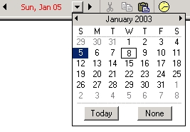
Example of a Date Selector
Issues the Date Selector Pattern Solves
The purpose of the Date Selector pattern is to allow the user to see a collection of available dates and select one easily. When implemented correctly, the user will be able to relate the calendar metaphor of the control to a traditional paper calendar, allowing the selected date to be recognized easily and making navigation to other dates simple. The Date Selector pattern can also be extended to show relationships for time-based business events, such as billing cycles for a financial institution or holidays for a scheduling system.
How a Date Selector Works
Typically, a single month is displayed, which is activated by an icon adjacent to a date-related data entry field. When activated, the Date Selector control appears adjacent to the data entry field without covering up the field label or the icon used to invoke it. The user is normally able to navigate to adjacent months or years. When the user selects a date, the Date Selector automatically closes and populates the data entry field with a valid, properly formatted date.
Here are some guidelines to remember when implementing a Date Selector.
- Always provide a visual indicator of the current date.
- Provide a distinctly separate indicator of the selected date.
- Disable unavailable dates.
- Never allow the user to select an invalid date. Invalid dates should be visible, but disabled.
- Provide dates in the appropriate international format, if applicable.
- Allow the selection of multiple months and years, if applicable.
- Do not force the user to close a pop-up Date Selector manually.
- Avoid showing minimize and maximize window controls on browser-based Date Selectors.
- Provide the user with a shortcut action that returns to the current date.
- Provide an appropriate range of dates for the task (monthly, weekly).
In summary, Date Selectors instantly should show the user a large domain of available dates, along with visual clues of the current, selected, and unavailable dates. Remember that a user can scan information far more quickly than clicking on an icon to view additional dates.
When to Use the Date Selector Pattern
You should use the Date Selector pattern when the available range of dates is unclear to the user or when the task is performed infrequently. This pattern should supplement the traditional data entry of dates and be provided as a secondary means of accepting dates from users.
Also, consider using this pattern when:
- The date is entered in an incorrect format or using improper syntax and cannot be used by the application.
- The user is likely familiar with the needed information, but may not be familiar with the required format or syntax.
- The user needs to enter the date quickly, but also requires it to be accurate.
Each Date Selector should allow the user to select only a single date. If the user needs to select a range of dates for a task, provide a separate Date Selector for each date to be entered.
In addition, if a date is unavailable, provide a visual clue to the user, so they can more easily select a correct date.
Examples
Good Example (Web) – Visual Clues for Valid Dates
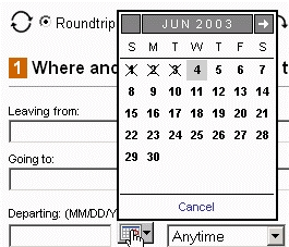
This example illustrates the use of an advanced Date Selector in a public, web application. The use of icons to indicate invalid dates and shading to indicate the current date provide quick, effective support for choosing the best date. Notice also how the selector appears directly above (while not covering) the label for the date data entry field.
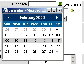
Good Example (HTML)
This example illustrates the use of a basic HTML-based Date Selector in a public, web application. The use of bold shows the current date while shading is used to show the current week. Notice the use of color to separate the header from the white selection area. This calendar is both simple to use and yet very functional. One improvement would be to disable the minimize and maximize window buttons.
Good Example (VB, C#, Java)
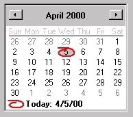
This example illustrates the use of a Date Selector in a client/server application. The use of color and an associated graphic provide good visual clues for the current date. Subtle use of gray indicates valid verses invalid dates for selection. The domain for selection starts on a Sunday as this is common for calendars used by the target audience. The buttons at the top are clearly identified and large enough to be used easily, allowing the user to select additional months.
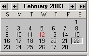
Bad Example (VB, C#, Java) – Confusing month/year selectors
The month and year selectors are very small and the different icons for month and year selection are not easily understood. Color-challenged users will not be able to detect the current date easily, as it relies on using the color red as the sole distinguishing feature. Finally, the vertical spacing between the rows of dates should be expanded to make selection easier.
Bad Example (HTML) – Confusing month selectors
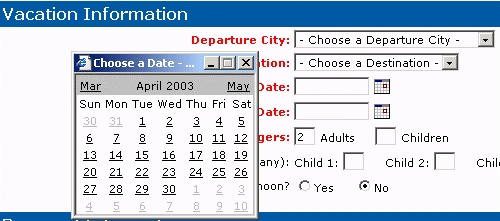
This web-based example does a good job of displaying available date ranges. However, the placement of the pop-up should not cover up the field label, as the user may have no clue as to which date is being entered. Notice there are two adjacent date fields on the form. Also, the technique of placing the actual month as a link may confuse some users who may think the available selection domain is March to May. Actually, the names of the links for the months change as the user selects different months. Finally, allowing the user to minimize the window will likely add more confusion; it should be disabled like the maximize window button.
Note from the field: The example above with text used as links to the months is a good example of a cool ‘feature’ that ultimately fails in actual usage. We often see Date Selectors become much more complex than necessary, resulting in scope creep and project overruns.
Sample Templates
(HTML Code, Photoshop Slices, and Style Sheets)
Available to users of GUIguide — our enterprise GUI design repository.
Or contact us for a free sample of a Date Selector for the Web!