Visual Framework
Successful UI designs focus on the wants and needs of customers, leverage familiar usability patterns, and maintain a consistent navigational flow. This can be accomplished through research on industry segments, interviewing users, conducting focus groups, and examining best-of-breed competitors. All user research, UI corporate guidelines, and product UI guidelines should be factored into the model to support the implementation.
The resulting visual framework supports a variety of models including the presentation model, which defines the overall look and feel of the application and important design decisions, such as browser support, layout constraints, and UI controls for navigation. A solid navigation model and supporting visual design patterns (VDP) to implement the essential user interactions are also included in the resulting visual framework. For instance, if the presentation model uses tab-based navigation in a web application, a documented VDP for tabs should be supported in the HTML prototype.
Sample Visual Design Pattern: Using Tab Patterns with Web Applications
Christopher Alexander, the famous architect and author of “A Timeless Way of Building” provides the inspiration behind patterns:
“A pattern describes both a problem, which occurs over and over again in our environment, and then describes the core of the solution to that problem, in such a way that you can use this solution a million times over, without ever doing it the same way twice.”
Classic System Solutions’ continuous work on projects in enterprise application design has provided us with many opportunities to encounter, ponder, and solve many user interface problems. One of them is selecting a single item from a list of categorized items using a folder metaphor, in other words, tabs. An example of tabs is shown below.

Issues this Pattern Solves
The purpose of the tab pattern is to allow the user to easily see all of the options available and select one. When implemented correctly, the user can easily relate the tab metaphor to a traditional paper file set of tabs, providing quick recognition of the selected tab and a basic understanding of how to make a selection. This pattern can also be used to show a complex object as whole, with each of its peer components displayed as a tab.
How this Pattern Works
Typically, tabs work as follows.
There should be a set of six to eight tabs, from which the user can select. Using more than eight tabs can significantly reduce usability, as the user is being asked to select a single item from too large of a domain set.
Ideally, the items under the tabs should be already known to the user or easy to categorize. The categorization of items should match the user’s conceptual model of the data being displayed.
The tabs should be presented to the user one at a time. While the tabs can be categories, they can also be points on a discrete scale, for example, the letters in an alphabetical index.
All of the tabs should be shown to the user, with the items for the current tab placed immediately underneath it. Tabs should be shown as tabular sheets. This relationship should be reinforced by showing the tabular sheets visually, i.e., connecting the items area to the current tab.
Tabs should be placed horizontally. Consequently, the number of tabs that fit in a layout is usually less than ten, unless an alphabetical index is used. The tab labels should also be shown horizontally.
There should always be a default tab that is the first one displayed.
The currently selected tab should be highlighted visually.
It should be easy for the user to switch between the tabs. Each tab should be reachable with one click.
When to Use this Pattern
Use tabs when the items to be categorized are static and mutually exclusive. Make sure that a folder metaphor matches the user’s mental model of viewing the data. Avoid using tabs with dynamic data.
Use tabs when the amount of information can be placed into a relatively small number of categories. To increase the utility of the tab metaphor, some designers will use multiple rows of tabs. Unfortunately, this increase in utility comes at great sacrifice to usability. Multiple rows of tabs are confusing and intimidating, particularly to new users. These users find it difficult to locate the desired tab. In addition, screen real estate is compromised, and the repositioning of the tabs to the front row causes tremendous confusion and complexity. For instance, Amazon got into trouble when they decided to use a tab for each store they opened. Soon, a single row of tabs evolved into a multi-row nightmare (shown below) which was eventually abandoned.

Good HTML Example
This example illustrates the use of tabs in a web application. HTML tables and in-line images are combined to create the illusion of a tab control. The user sees multiple tabs on a single web page, when, in reality, selecting a tab loads a new HTML page from the server (often referred to as “round-trip HTML”).
For high volume transactional systems that display complex data across a set of tabs, you can open multiple threads to a server and asynchronously load and cache data from multiple tabs. This reduces the number of trips to the server and significantly improves the response time of the user interface, as the user moves between the tabs.

Bad HTML Example (confusing appearance)
The Downloads “tab” in this example is currently selected, but it seems to be part of one of two much larger tabs, each having five menu items. The diagonal line between Monitoring and Testimonials confuses the eye by suggesting that the right hand “tab” is layered in front. Tabs should be recognizable as tabs; text contained in a rectangular box with square corners does not look like a tab. Too often, web page designers confuse navigation bars with tabs.

Good and Bad HTML Example (color identification)
Notice how the Home tab is separate from the remaining tabs. This is a good approach if there is a logical distinction between the tab categories. This is also an example of how NOT to use colors and font styles. The white text looks washed out over the pastel colors, and the shadowed font is very hard to read. Black or a dark font color would have been more effective.

Good VB / C++ Example
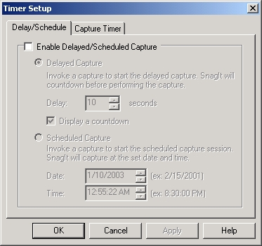
This example is typical of a property sheet in a traditional Windows application. Each of the two distinct items located on the tabs, combined under a general feature labeled Timer Setup, can be selected easily by the user. Using tabs avoids having to create two separate dialogs and associated menu items, thus flattening out the navigation model.

Technical Framework
Successful HTML prototypes not only provide a platform into which the developer can integrate back-end technology, but also provide a sample of working DHTML solutions into which front-end technology can be customized. The HTML prototype should be designed under coding standards that ensure design fidelity, promote code sharing, optimize performance, improve readability, accommodate for integration, and allow for easy maintenance.
For instance, if some forms in a web application have a great deal of complexity, where hide/show functionality can greatly impact the usability of the application, a technical framework to support this type of UI interaction should be included in the prototype.
Sample DHTML Pattern Solution: Interactive Select Form Elements
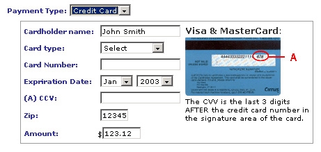
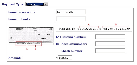
The purpose of this pattern is to reduce screen clutter by displaying only the relevant information, based on the selections made by the user. When implemented correctly, information is displayed based on a value selected from a select box. An example of an interactive select form is shown below.
Issues this Pattern Solves


areas.
This pattern and many others will be discussed in detail at our upcoming Advanced Web 2.0 Applications seminars.